Listen to the March 30, 2018 episode of the NPR podcast Invisibilia. This podcast, which focuses on the invisible forces that shape human behavior, begins their fourth season by digging into the concept of behavior patterns -- asking if it's possible for us to truly change and to elude behavior patterns that have become ingrained or that we grew up with -- it explore the notion of instinctual behavior and looks at how patterns and assumption of patterns have been used to oppress people, particularly in criminal law. And the podcast ends by urging us all to consider the importance of not being bound by pattern thinking -- as a political project.
Wednesday, April 11, 2018
Tuesday, April 18, 2017
Everyday Bread
Now featured on Visual News: Inspiration and education for data storytellers is
Everyday Bread

Everyday Bread


https://www.visualnews.com/2016/03/30/thread-butter-embroidered-bread-arty-think/“My concept is [the] expression of my personal relationship with textile. I love textile art, and I can‘t live a day without it,” Krnáčová says.
Wednesday, December 07, 2016
Tarot Reading for the Bubble
Santa Cruz, CA

Where we are, in our present position is the completion card. The four of wands.
it’s the end of an era, we’ve reached the end of this cycle.
And we are crossed with Ruin. 10 of Swords.
We broke it, our thoughts, our concept of how the world could be. The sun in Libra can’t take the heat, justice is too powerful and perhaps we are burning in the face of all that is just.
It hurts to think.
Defeat is in our conscious thoughts. Anything can be made to look bad.
it’s a matter of perspective, which means, we’ve lost. At least, in our conscious thoughts.
it’s a matter of perspective, which means, we’ve lost. At least, in our conscious thoughts.
In our unconscious, the Knight of Cups holds out hope, that ever elusive home in which we can feel safe. We will go towards that dream.
In our recent past is the Success card, the six of disks, moon in cancer, thinking our slow and steady progress into a system. We felt the Earth, and she felt us back.
In our near future, the Queen of Cups beckons to us to love ourselves, retreat, hide, become like a mirror to those and they might just not be able to perceive us. Still waters provide reflections.
 The Fool is who we are right now.
A grand zero, empty, ready to be filled. Full of the potential of our own most incautious imaginings. The fool is an important card. The life force, the indeterminate potential of not knowing. Being open. Throwing caution to the wind. The trumpiest of all trump cards, the nothing, joker of the Major Arcana.
In our environment is The Lovers card, the cupid who binds us to our inverse, matched in some kind of perverse holy ordained matrimony. The dark forces meeting the light.
Our hopes and fears are the worry card. Perhaps this is a worry that we aren’t worrying enough.
And yes, cruelty is our result.
And what I want to tell you is that,
it is necessary to feel,
to understand that cruelty inflicts pain and see the blood that we shed while being stabbed in so many places in our minds. There will be blood and we will bleed.
And what I want to tell you is that,
it is necessary to feel,
to understand that cruelty inflicts pain and see the blood that we shed while being stabbed in so many places in our minds. There will be blood and we will bleed.
That might be the most human thing that we can do.
At least that’s what the cards say.
The only trumps are the lovers and the fool.
At least for today.
Tuesday, December 06, 2016
States Rights for Liberals
 |
Why not use their game against them?
Cal-exit, and maybe just maybe they'll come crawling back.
Or better yet, just let 'em crumble. If we start working really hard, maybe the really terrible destruction won't reach us. We're practically Canada.
Deep in the bubble, we yearn for our utopian oases.
The sunshiny doom perveyors say, at least it gets a lot of clicks.
Ahhhhhhhhh. Retreat, retreat.
If we make our selves invisible, maybe the trolls will get bored and stop looking for us.
Go away evil people. Go away.
New Yorker Magazine COMMENT
POST-ELECTION, LIBERALS INVOKE STATES’ RIGHTS
In response to Trump’s hostility toward immigrants,
political leaders in New York and California vow to protect their most vulnerable. |
Tuesday, October 06, 2015
Repellent Fence
Social practice, landscape art work which imaginatively engages with a utopian, borderless conception of communication, breaks through human-centered notions of "airspace" as territory. Art in the clouds, thinking about "the cloud" and floating and virtuality, and resisting nationalist concepts of culture and identity. Also thinking about cross-cultural communication, intercultural as well as interspecies relationships and indigenous forms of medicine. Also note, the collective and collaborative nature of their practice. And the reference to fences makes me think about another imaginative fence - Christo's "Running Fence."
From their website:
"The Repellent Fence is a social collaborative project among individuals, communities, institutional organizations, publics, and sovereigns that culminate with the establishment of a large-scale temporary monument located near Douglas, Arizona and Agua Prieta, Sonora. This land-art work is comprised of 28 tethered balloons, that are each 10 feet in diameter, and float 50 feet above the desert landscape. The balloons that comprise Repellent Fence are enlarged replicas of an ineffective bird repellent product. Coincidently, these balloons use indigenous medicine colors and iconography -- the same graphic used by indigenous peoples from South America to Canada for thousands of years. The purpose of this monument is to bi-directionally reach across the U.S./Mexico border as a suture that stitches the peoples of the Americas together—symbolically demonstrating the interconnectedness of the Western Hemisphere by recognizing the land, indigenous peoples, history, relationships, movement and communication."
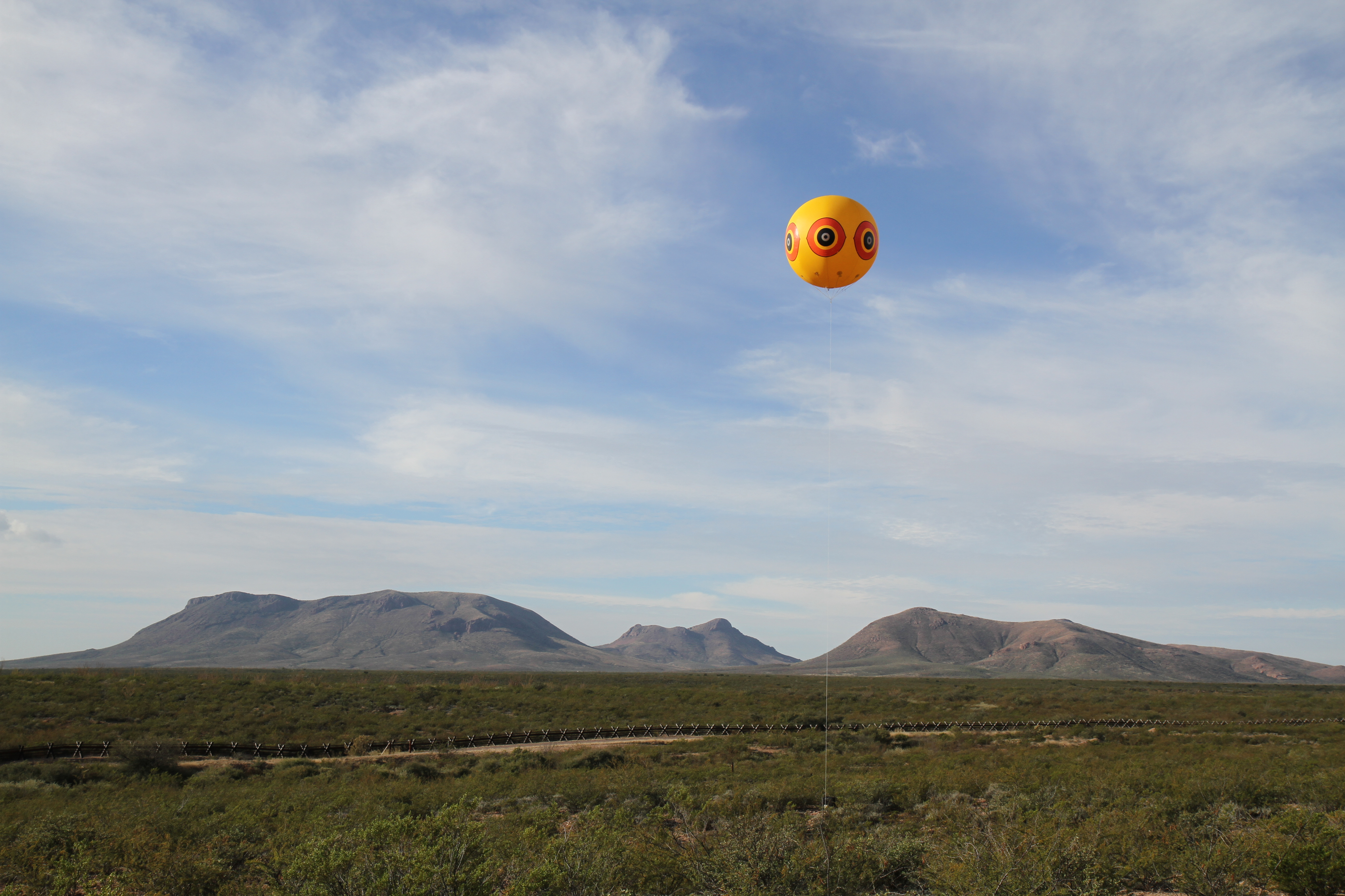 |
| artist study of balloon installed near the border fence |
"The Repellent Fence is a social collaborative project among individuals, communities, institutional organizations, publics, and sovereigns that culminate with the establishment of a large-scale temporary monument located near Douglas, Arizona and Agua Prieta, Sonora. This land-art work is comprised of 28 tethered balloons, that are each 10 feet in diameter, and float 50 feet above the desert landscape. The balloons that comprise Repellent Fence are enlarged replicas of an ineffective bird repellent product. Coincidently, these balloons use indigenous medicine colors and iconography -- the same graphic used by indigenous peoples from South America to Canada for thousands of years. The purpose of this monument is to bi-directionally reach across the U.S./Mexico border as a suture that stitches the peoples of the Americas together—symbolically demonstrating the interconnectedness of the Western Hemisphere by recognizing the land, indigenous peoples, history, relationships, movement and communication."
Tuesday, September 22, 2015
About Trees - Katie Holten
Download Trees as font: https://drive.google.com/file/d/0B_wSE8cfX-fgWkVMN2p4YXVzcEU/view
Interview in Asymptote Journal:
Translating Borges into Trees: An Interview with Book Artist Katie Holten

"I think of the book as an archive of human knowledge filtered through branches of thought."
Katie Holten is an Irish artist. She represented Ireland at the 50th Venice Biennale. Solo museum exhibitions include New Orleans Museum of Art (2012); Dublin City Gallery The Hugh Lane (2010); The Bronx Museum, New York (2009); Nevada Museum of Art, Reno (2008), and Contemporary Art Museum St. Louis (2007). Committed to social causes, especially as they pertain to environmental issues, Katie is fascinated with the inextricable relationship between man and the natural world in the age of the Anthropocene. She is the artist behind About Trees, the first book in Broken Dimanche Press’s new series Parapoetics: A Literature Beyond the Human. Her artwork can be found at katieholten.com.
***
Asymptote: How would you describe About Trees to someone who hasn’t heard of the project?
Katie Holten: About Trees is a book about trees written in trees. It’s a collection of texts about trees, about the notion of trees, and a constellation of tangential tree-related things. Everything is translated into Trees, a new typeface that I made especially for the project. At the core of the book is aTree Alphabet with trees replacing each of the 26 letters of the standard English/Latin alphabet. These characters were transformed into a font, the typeface called Trees.
The book is limited to an edition of 500 copies. It’s 260 pages deep, stitched, printed throughout using a forest-green spot-color with a hand-painted, lime-green fore-edge. It started out like a collage, a collection of found and mostly ‘recycled’ texts. Some were commissioned especially for the book and others happened along the way during conversations with people. There’s an essay on “Tree Clocks and Climate Change,” a hunt for “Liberty Trees,” and a conversation asking “Why are There no Trees in Paleolithic Cave Drawings?” Trees are a metaphor, a way to filter the enormous, tangential web of information available to us—a way to focus the discussion. Everything is printed in the typeface Walbaum (which hasbaum, the German word for tree, in its name) and translated into Trees. Each text becomes its own forest.
I think of the book as an archive of human knowledge filtered through branches of thought. It traces a shift in consciousness from anthropocentric thinking to a contemporary realization that our way of life has probably created a new geological epoch, the Anthropocene. The book maps the move from Darwin’s “I think,” written beside his sketch of the tree-of-life illustrating human consciousness as the highest step on the evolutionary tree, to Eduardo Kohn’s “How Forests Think,” an anthropology beyond the human. The writings of Bruno Latour and Timothy Morton have been useful for me to understand my own work and current thinking around object-oriented ontology, which puts things at the center of the study of existence.

Page 26 from About Trees, 2015. Tacita Dean’s essay “Michael Hamburger” translated into Trees.
I’m fascinated by our understanding—and misunderstanding—of the systems around us. Man-made systems, like cities for example, mirror microscopic bacterial colonies. Yet we humans tend to see them (cities, or indeed most man-made things) as being something completely removed and separate from ‘nature’. These colonies, whether fungal, organic, man-made, microscopic, or intergalactic, all mirror each other with similar growth patterns that repeat at different scales. These clustering, branching patterns shape everything from our lungs and neural pathways to cracks in the mud, lightning, river estuaries, evolutionary paths, language development, algorithms, and the Internet. There’s something about trees that’s universal.
The book started out as a small project but grew into something larger, the way things do. Now it feels like an anthology or a compendium. I’ve starting thinking of it as Volume I in a grand—possibly infinite—series of volumesAbout Trees.
How did you come up with the idea of creating a typeface out of trees?
The Trees typeface has roots reaching back to 2004 when I moved to New York City. I was researching our understanding of ‘nature’ and our relationship with it in the city. The first drawing I made was on a small piece of paper, just a normal 8.5” x 11.5” page. It was of a collection of New York street trees. The trees were drawn quite small and it looked kind of like a letter. A love letter? I’m not sure. But it looked like a letter scrawled in a strange language. I made more and the trees fell into a grid, mirroring perhaps the Manhattan street grid. They were my notes telling the story of my time in NYC—the grid walked that day and the street trees passed along the way.
I’ve worked on lots of other projects since, but over the years people kept contacting me about those tree drawings. I see strangers share them online and they have 200,000+ likes on sites like Pinterest and Tumblr. I don’t know exactly what that means, but the tree drawings have a life of their own. It feels like they exist out there in the ether. They communicate: people respond to them. I’ve always liked the idea of giving things away. So, over the last ten years I’ve often thought: wouldn’t it be nice to make the tree drawings into something that people can access and use themselves. They should be available as prints, tattoos, a font, a typeface. Something ‘tangible’ that people can hold, wear, use, rather than a JPEG or screenshot that’s only available to ‘like’ on a screen. I thought, the tree drawings should actually exist in real life. I can use the trees to communicate and tell a story and people might pay attention because so many seem besotted with them.
A few things came together this winter which led me to revisit the drawings and create the Trees font: I was invited to make new tree drawings for a group exhibition (called About Trees) at the Zentrum Paul Klee in Bern, Switzerland; I’d been wondering if there was a way to make my older tree drawings more accessible to people; I kept thinking about the notion of writing with trees, or using trees to write; and I’d been talking with Broken Dimanche Press about developing a book project. I realized that all these different things—book, drawings, trees, typeface—could come together into one project: About Trees. It was nice to see it crystallize so quickly.
How do trees connect with language?
For me there’s a direct connection between trees and language. In Ireland we have what’s known as Ogham. It’s a medieval alphabet scratched onto standing stones. No one knows for sure how it worked, or what it signified. But growing up I was told that it was some kind of tree alphabet: the marks, or scratches, represented different trees. For example, Beith = “birch” andDair = “oak.” Somehow these scratched markings relayed messages to people.

Ogham Alphabet: fol. 170r of the Book of Ballymote (1390), the Auraicept na n-Éces explaining the Ogham script.
I’ve always been fascinated by language, by systems of knowledge, by archives. I wanted this book About Trees to look at all of that through my own personal, man-made language. The texts look at the world around us, at the ways we’re embedded in—and have affected—the world around us. Elizabeth Kolbert writes about “Islands on Dry Land” and how our species has cut into, and cut through, every wild place. Creating unnatural lines in the landscape—slashing through rainforests, installing pipelines—we are literally changing the shape of the world. Things in the organic world have a way to communicate that seems to work beyond our notion of language. There’s a reason things are the way they are. There’s a reason trees are structured the way they are. Brian Enquist talks about that in his essay “Tree Theory, Biogeography and Branching.” You could say that this natural language is a code that’s been developed over millions of years. It’s beyond us. We’re not sensitive enough to ‘get it.’ To us it’s just indecipherable, messy, nature. Like a newspaper in a foreign language, it’s gobbledygook. From a distance it looks ‘normal’ and readable, but when you get a little closer you see that it’s impenetrable, purely visual. It’s essentially written in code and you don’t have the key.
For a long time I’ve felt that our language is broken. We don’t know what things mean anymore. At least I don’t. What is ‘nature’ exactly? What is ‘environment’? Or ‘landscape’? Or ‘green’? Robert Macfarlane writes in the book about “Branches, Leaves, Roots and Trunks,” about lost words, words that have disappeared from our vocabularies and dictionaries. I wanted to see what would happen if I made my own alphabet, my own typeface, and translated the word/world.
Then of course there’s the tangible connection between trees and language. Language is stored in books, books are made from trees. Anna-Sophie Springer’s essay on “The Library as Idea and Space” doesn’t mention the word ‘tree’ but they’re implicated throughout as she discusses the history of collecting, the library, and ‘the madhouse of books.’
Can you explain the “mechanics” of your typeface—does one tree represent a letter, or does it represent a word/idea?
It couldn’t be simpler. I drew a tree for each of the 26 letters of the alphabet. It’s like a children’s ABC. A is represented by a tree whose name begins with the letter ‘A,’ B is represented by a tree whose name beings with the letter ‘B,’ etc. The Tree Alphabet drawing/print/bookmark is the key to unlocking the code. When I was in Berlin working with the designers and exploring how we were going to use the Trees typeface, we made a set of bookmarks. They were a way for us to test the font while also making something useful (I used the bookmarks as postcards and thank you cards for people who pre-ordered the book). One of the bookmarks depicts theTree Alphabet and with it you can attempt to translate the book.
The mechanics of creating the typeface was more complicated. I’m technologically challenged, so I needed help. A friend connected me with one of her students, Katie Brown, and luckily for me she was already working on hand-written fonts and was excited to plunge right in. I scanned all my tree drawings and she turned each one into a vector file and then worked on them individually and inserted them into Glyphs, a font-making program. I got the file with the finished typeface—the Trees font—the day I left for Berlin to meet the designers. None of us knew if it was going to work. But it did!

Katie Holten, Bookmark, 2015.
The biggest problem was how to use the font. How exactly should we translate the original texts into Trees? The ‘letters’ in the tree font take up more than four times as much space as letters in a normal font, so 100 pages of English text would translate into over 400 pages of Trees. That could be really interesting, or incredibly boring. Never mind the waste of paper and trees! I spent a lot of time working out different ways to translate each text. I finally decided that each text should be translated into a forest. With short texts it’s possible to see/read each individual tree/letter in theTrees translation, but with the longer texts the trees crowd together forming dense forests of encoded meaning. It becomes literally impossible to translate them. That’s what I’m interested in: the impossibility, the futility of it all. The conventional process by which human, symbolic language runs from thing to idea via word is reversed by translating each text into a cryptic tree-forest. Language is turned back upon itself by (re)turning letters to a pictographic field.
The texts in About Trees range from lyrics by Radiohead to literature by Plato and Ursula K. Le Guin. How did you select the texts for this project?
There are very specific reasons why each text is included. And there are so many more texts that I’d like to include but couldn’t, for all the usual reasons; lack of time, money, space. It really does feel like Volume I of a potentially infinite series.
My initial proposal was for a book with texts by three women. But pretty quickly I realized that I wanted to have a wider selection, mirroring how we’re bombarded by information all day, every day. So there are contributions ranging from super-short (a one-word poem), to short (an Instagram post, the title of a novel, Le Guin’s “The Word for World is Forest”), to one-page meditations and longer essays.
There are a few key texts for me: things that I had to include in the book in order to anchor it. These include Nicole Davi’s essay on “Tree Clocks and Climate Change,” Aengus Wood’s essay on the Ogham alphabet and my conversation with Conny Olsson from Arctic Paper Munkedal, the paper mill where the paper for the book is sourced.
Another important text appears three times in the book; at the beginning, middle and end. It’s a sentence from Jorge Luis Borges’s short story “Funes el memorioso.” Each iteration is a different translation, so each time you read the sentence it’s the same, but not.
Ida Bencke’s text was the very last thing to be added, literally as the book was going to print. The last thing we worked on was the cover and suddenly we needed an image for the dust jacket. I wanted to include a forest, but I didn’t want to repeat a text/forest that was already in the book. Ida had written a short text “About About Trees” to contextualize my book within the Parapoetics project that she’s curating for BDP. My book doesn’t include an introduction or a foreword or anything at all to explain it. I prefer to let things be themselves and exist on their own terms, without me putting words/thoughts in the reader’s head. But I thought that Ida’s text, translated into Trees on the cover, could work as the introduction. It’s a forest, indecipherable as a text. No one can actually read it. It mightn’t evenlook like writing. You can’t see the wood/word for the trees. We placed the English translation (i.e.: the original text that Ida wrote), on the inside flaps, typeset in Walbaum like the rest of the book. So, anyone who opens and engages with the book can read her text and understand that the forest on the cover is actually a text, translated into trees.
What experience are you hoping readers will gain from rediscovering these texts with your new typeface?
I hope the book provides an opportunity to (re)discover these writings. I also hope readers can consider their relationship with language, landscape, and perception. For me, the Trees typeface is a way to examine my own relationship with information, knowledge, time, memory, and my place as a human on this planet in the Anthropocene.
I would like the book to affect, even just a little bit, how people read the world. I feel that as a species we’ve convinced ourselves that our version of reality is right, that what we do is right. I fear it’s not. We’ve used language to twist the meaning of things.
The contributors provide a wealth of knowledge and material. I’m like a gleaner, but instead of picking blackberries from a hedgerow or collecting empty bottles from trashcans, I’m gathering words. So much valuable material exists out there in the world, but gets overlooked and forgotten in the data overload. I wanted to include something by James Gleick, as his writing about science and knowledge was so important to me growing up. I ended up including an article he wrote on Benoît Mandelbrot. I hope some readers, if they haven’t already, will take the time to read his book The Information: A History, A Theory, A Flood, a book about everything. I hope that my book About Trees is the tip of an iceberg that leads readers on a journey through all these amazing, existing works.
“The past is a foreign country,” one of the contributors wrote to me in an email. I think the present is also a foreign country, and we have yet to learn the language. By bringing together a disparate group of texts, I wanted to try and understand our present. Translating everything into a new, indecipherable language makes it obvious how little we know.
***
About Trees will be launched by Broken Dimanche Press at the New York Art Book Fair at MoMA PS1 September 18-20, 2015.
Wednesday, September 03, 2014
Marina Abromovic and the NeoLiberal artist
Re: article in Hyerallergic from July 31, 2014 about Marina Abramovic's seeking unpaid workers for her Institute:
http://hyperallergic.com/140998/marina-abramovic-institute-seeks-so-much-unpaid-work/
http://hyperallergic.com/140998/marina-abramovic-institute-seeks-so-much-unpaid-work/
Thursday, February 27, 2014
Role of Chance in Success
Perhaps, with our current collaboration with computer technologies, we are now seeing a kind of speculative time come to stand in for or even replace the formerly idiosyncratic, individual space of speculation. It's a 21st century iteration of speculation which becomes unhinged from the personal and moves into a space of networked, collaborative, machine control over subjectivity.
Friday, December 13, 2013
Hilma af Klint: The Spiritual in Art
| Hilma af Klint: A Pioneer of Abstraction | |
 Edited by Iris Müller-Westermann Just before her death in 1944 at the age of 81, the Swedish painter and mystic Hilma af Klint stipulated that her paintings were not to be publicly exhibited for 20 years. In fact, another 40-plus years were to pass before inklings of her vast oeuvre began to reach public consciousness, with the landmark 1987 exhibition and book The Spiritual in Art. Since then, critics, artists and historians have praised her with ever-increasing awe, and today af Klint's paintings, watercolors and sketches—numbering over 1,000 in total—have never looked so contemporary, presaging as they do the works of Beatriz Milhazes, Elizabeth Murray and Tal R., and Agnes Martin, Emma Kunz and Arthur Dove before them. For af Klint herself, as a medium for an art she was despairingly unable to comprehend, contemporaneity was irrelevant: her work—much of which was dictated by a spirit guide named Ananda—unfolded in complete ignorance of Kandinsky, Malevich or Mondrian, who likewise practised an abstraction informed by theosophy and occult philosophy. Af Klint's abstractions preceded those of Kandinsky, who is usually credited with inventing abstract painting: as early as 1906, she was devising large-scale canvases filled with grids, circles, spirals and petal-like forms—sometimes diagrammatic, sometimes biomorphic. She was painting watercolor monochromes in 1916, and making automatic drawings long before the Surrealists. This monumental 280-page monograph, with 200 color plates, is the first full Hilma af Klint overview. A landmark publication, it not only reveals the moving lucidity of her art, but challenges the narrative of abstract art in the twentieth century. | |
Thursday, November 28, 2013
Scoliosis debut starring Frances MacDormand
Reposted from Wall Street Journal article:
http://online.wsj.com/news/articles/SB10001424052702304011304579222020557961620
NY CULTURE
'Bodycast' Won't Confine This Actress
Oscar-winner Frances McDormand Relays Artist's Trauma By Nov. 26, 2013 10:16 p.m. ET
 |
| Frances McDormand runs through her lines. Alison Rosa |
For four sold-out nights in December, Oscar-winning actress Frances McDormand will deliver a monologue with little more on stage besides her, a PowerPoint presentation and off to the side, a woman feeding her lines via an earpiece.
The woman, Suzanne Bocanegra, is the creator of "Bodycast," a theater work that delves into her experience as a teenager in Texas with scoliosis, a condition that causes the spine to curve and was, in her words, "a social trauma."
"It sucked," she said. "I went to a large Catholic high school, and I had to wear a uniform over my body cast that didn't fit."
She and Ms. McDormand, who declined to comment on the performance, met at a 2011 experimental-performance festival where Ms. Bocanegra's first theater piece, "When a Priest Marries a Witch," was being shown. Ms. McDormand said over post-show drinks that she wanted to work on her next project, Ms. Bocanegra said.
"I told her that I had two stories left to tell," said Ms. Bocanegra, who, like Ms. McDormand, is 56 years old. "One about my grandparents' farm in La Grange [Texas], and one about the two years I spent in high school in a body cast. She said, 'I'll take the body cast.'"
The setting is spare, as it would be for a museum lecture, with the presentation behind Ms. McDormand, who is standing. The vocalist Theo Bleckmann and former dancer Emily Coates make appearances, adding further theatrical elements to the work.
Neither Ms. McDormand, who won her Academy Award for "Fargo" and has been nominated three other times, nor Ms. Bocanegra will be elaborately costumed. "We're not really sure what we're wearing," Ms. Bocanegra said. "But it will be something out of our closets."
Ms. Bocanegra, whose work as a visual artist has been shown at London's Serpentine Gallery and Los Angeles Hammer Museum, began her path to theater with an invitation from the Museum of Modern Art to present an artist's talk. "I wanted to push it somewhere outside of myself, and outside of a slide presentation," she said.
She penned her story of becoming an artist, titled it "When a Priest Marries a Witch," and turned it over to Paul Lazar, an actor and director with a 20-year history of melding words, music and dance as co-artistic director of the New York-based Big Dance Theater.
He agreed to perform "When a Priest Marries a Witch," and after its MoMA premiere, the pair hit the road, presenting it in museums and festivals across the country.
"Suzanne is quietly animating the world on stage with her ideas," said Mr. Lazar. "Visual artists act from such an intuitive and mysterious place, and yet Suzanne can describe the way her art mind works in a disarmingly simple, direct and surprising way."
For a 2011 performance at City University of New York's Prelude Festival, he invited Ms. McDormand, who he had worked with in the 2010 Wooster Group production of "North Atlantic," a military satire. By the end of the evening, the three of them had decided to tackle "Bodycast."
In "Bodycast," Mr. Lazar switched to the director role. Ms. McDormand, as the lead performer, tells the stories as if they were hers, but Ms. Bocanegra has an onstage presence too, feeding the lines to Ms. McDormand.
The three of them rehearsed in an unusual venue. Beyond the living room and kitchen in Ms. Bocanegra's SoHo loft, there is a 40-seat theater with a 12-by-14-foot stage outfitted with a lighting and sound system by theater designers Jim Findlay and Jody Elff.
It is a throwback, said Ms. Bocanegra's husband, the composer David Lang, to a long-ago era when artists could afford to live and work in SoHo, collaborating and performing in each others' lofts. "There's a historical re-enactment thing going on," he said.
Within earshot of the theater is Mr. Lang's own studio, which allowed for eavesdropping through "Bodycast's" creative process. "It was very free-flowing," he said. "Because they're three people working in this tiny environment in this intense way, everyone was in everyone else's department."
It is Mr. Lazar's favorite theater in New York. "Its purpose is to be a place for artists to try ideas out and benefit from the response of other artists," he said. "It's a collective brain or heart, pulsing away and producing exquisite life and art experiences, outside of the ever-exasperating arena of critics and presenters."
"Bodycast" is even further outside the professional environment where Ms. McDormand typically dwells, but Mr. Lazar wasn't surprised that she attached herself to it.
"Fran is a free spirit," he said, "whose nature is to jump at what excites her."
http://online.wsj.com/news/articles/SB10001424052702304011304579222020557961620
Friday, November 22, 2013


Thursday, September 26, 2013
Notes from "Hitchcock"
Aesthetic comparison between "Psycho," "Silence of the Lambs" and "Hitchcock." The cheesification of the performance of an artist performing on the edge, trying to evoke the aesthetics and yet reveal something more historical. The role of the woman, the wife, the obsession, the fetishization of surveillance, the nefarious aspects of the late Eisenhower years - its prudish obsession with secrecy around sex and violence, the demonization of the queer. The sexual repression of Hitchcock and the utter sexual frustration of the marriage of aesthetic minds battling and ultimately coming to celebrate on another, the dual of the sexes. What "Psycho" says about Alma, feminism, misogyny.
How could Jonathan Demme be so devoted to Hitchcock, the master controller. What about the tragic, twisted, sociopathic queer. Jodie Foster as contemporary Alma Hitchcock.
 The brilliance of the casting - Anthony Hopkins and Helen Mirren, the ultimate sexy older woman, brilliant inspiration actress. Anthony Hopkins who made Hannibal Lector a household name, returns to play the master himself. And Scarlett Johansson as the coquettish sex kitten California dumb actress with savy appeal and perky period appropriate physique. Finally, the brilliant Toni Collette hiding behind the perfect proto-Mad Men all-knowing secretary who secretely writes the history.


Tuesday, March 12, 2013

Friday, March 01, 2013

Tuesday, February 26, 2013
New Yorker resident feminist responds to Oscar horror
She's a bit more strident than I would have been, but her catalog of the night's lowest and deepest curves is full.
http://www.newyorker.com/online/blogs/closeread/2013/02/seth-macfarlane-and-the-oscars-hostile-ugly-sexist-night.html

http://www.newyorker.com/online/blogs/closeread/2013/02/seth-macfarlane-and-the-oscars-hostile-ugly-sexist-night.html
Thursday, January 17, 2013
Embarrassment is the Key to Enlightenment: Tiny Furniture and the Composition of Meta-Mumblecore

Totally. We are annoyed by Lena because she's so successful. We are annoyed by her because she was born into that privileged, New York City cultural elite, a child of successful New York artists who has become even more famous than her parents and at a way younger age. And then there's that creepy, apocryphal line in the film when Dunham's actual mother, the artist Laurie Simmons, playing the main character's successful artist mother, says to Aura: "oh, you will be more successful than I am, really, believe me."
As Schrader so brilliantly suggests in his interview on the DVD extra, Tiny Furniture is appropriating the mumblecore genre. Our contemporary obsession with the minutia of self, write DIY as videos in which "me and my friends are gonna make a movie about me and my friends talking about me and my friends." Schrader suggests that Tiny Furniture is too representative of its genre and that this "too representative-ness" is what creates the hostility. He suggests that this movie about a young woman who only worries about herself and takes her clothes off, makes us want to slap her. Schrader assures us that he believes the film to be tightly scripted and well-written, which uses good storytelling. But then he claims that it's good filmmaking pretending to be "amateur" and that's where we differ. I don't think Tiny Furniture is pretending to be amateur at all. I think it's aspiring to be photographic and cinematic and metaphoric in the most foreign filmy type of way. The only false or ironic note I detect is when Aura claims she hates foreign films.
Which brings to me to the question: what is Tiny Furniture about? Is it the failure of composition to protect us from embarrassment? Is it the beauty of, the preciousness of the minute, the intimate, the horror/the necessity of the 'real,' the elusiveness of it. It is anamorphic, expressively photographic, landscapes of embarrassment, striving, jealousy. The fear of loss, of losing what you maybe don't yet even have. Dunham frames the innate ugliness, the selfish entitlement of the world in which she is a happy yet reluctant member. She questions what passes for success in the New York City these days, she questions the values of her world even as she expresses them in a glossy, shallow depth of field lushness. Schrader says that Dunham's emphasis on composition is a kind of artistic proof of her work, evidence of her structuring and originality.
Finally, Schrader asks if the film is a representative of Future Film or of a dying genre. "In many ways, (it is) an old fashioned film wearing these new raggedy clothes." I dunno, Paul, those clothes don't look so raggedy. 5D digital filmmaking is looking mighty fine in that indie NY Tribeca loft. If the film is representative of anything, I would say, it's the enduring power of French film, of European cinema, as much as Woody Allen, to inspire a young American woman of today to be her powerful, self-deprecating self.
Ultimately, I think Tiny Furniture is about getting all the mistakes out of the way. It is about being a loser, and what is lost is the kind of virginity that New York demands its citizens lose, even today, after all these gentrifying years later, all these years of wealth and power and slickness later, you still have to get fucked in order to live here. And, Dunham's character endures through all humiliation in order to finally get her tickling time in bed with her mother.
Lena on Nora Ephron:
http://www.newyorker.com/online/blogs/culture/2012/06/lena-dunham-remembers-nora-ephron.html
I love that Lena loves Nora. Nora Ephron, married to Carl Bernstein, wrote the novel and then directed her own film version of their bitter breakup and divorce. Nora and Lena talk about Woody Allen and the ways he influenced both of them in the DVD extras of the Criterion Collection's "Tiny Furniture."
Wednesday, October 24, 2012
Blue fixations

AND this:
Friday, July 06, 2012
1000 melting ice men

Subscribe to:
Comments (Atom)